
Gallery
Here are some videos and images of the websites and software that I've made.
App
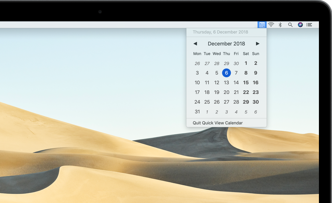
Quick View Calendar
The Quick View Calendar menu bar app provides a compact, simple and clear calendar for macOS. Typography and whitespace clearly renders weekdays, weekends and days outside the current month in both light and dark modes. Quick View Calendar was designed as an experiment in settings-less design by using the preferred language, calendar and highlight colour system preferences to adapt to each Mac. Quick View Calendar also automatically supports all of the languages available on macOS.
Video
Literary Atlas D3 SpanChart
The Literary Atlas SpanChart is a D3 visualization that presents the lifespan and working life of 29 authors. Light green bars represent lifespans, and dark green lines represent the period between their first and last published works. Users can sort the authors by birth year, lifespan or working life and the rows animate during sorting. A vertical timeline scrubber shows the exact year when mousing across the chart.
Video
Literary Atlas D3 Date Range Control
The Literary Atlas D3 Date Range Control filters the Library page's map and table view of novels set in Wales. A Leaflet map plots each novel's primary location and a sortable table lists these novels. A D3 frequency chart shows the number of novels published each year. Users can drag a double-ended slider to select a publication year range, filtering the novels on the map and in the table. The frequency chart updates to highlight the selected data range.
Video
Literary Atlas D3 Coverage
The Literary Atlas Coverage page is a visualization that presents the geographical coverage of 12 novels set in Wales using D3 SVG layers. The SVG layers scale smoothly at any zoom level and the plain, dotted and striped fill patterns enable multiple comparisons with fewer colours.
Video
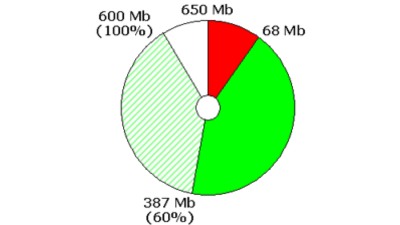
D3 Geo Hexbin
The D3 Geo Hexbin is a coordinated D3 hexbin, time series and pie chart visualization of timestamped latitude and longitude data. The hexbin shows the number of geocoded data items aggregated into hexagonal regions. The time series shows the number of items generated on each day. The pie chart shows the percentage of data items selected by the time series. Selecting a data range with the time series updates the hexbin to show only the selected data and updates the pie chart with the size of the new selection.
Video
D3 Network Metrics Explorer
The D3 Network Metrics Explorer is a coordinated D3 network and table visualization for exploring various Krackhardt Kite Graph network centrality measures. A set of radio buttons built with D3 control the currently selected network metric: degree, betweenness, closeness and eigenvector. The network view is created with a D3 force-directed layout. The area of each node represents the centrality value of the node for the currently selected metric. The tabular view of the network metrics is built with D3 using the centrality measure names and values to populate the table. Mousing over a table row highlights the row and highlights the corresponding node in the network. Similarly, clicking a node in the network highlights the corresponding table row. The node and row highlighting is implemented by adding and removing the highlight CSS class that specifies a 100ms transition to smooth the change. Try the demo
Video
D3 Country Bubble Chart
The D3 Country Bubble Chart demonstrates various ways in which D3's forces simulation can lay out elements. Each element represents a country as a circle with an area proportional to the UN's 2015 population estimate of the country. Each circle is filled with a color or the flag of the country. One set of radio buttons control whether each circle is filled with a color or the flag of the country. The color represents the continent of the country and is chosen from the schemeCategory10 palette using an ordinal scale. This visualization also demonstrates how to animate D3 axes on and off the screen when selecting and de-selecting the Population circle grouping. Additionally, the continent color key demonstrates how to create a color key. Try the demo.
Video
D3 Twitter Geo Stream
The D3 Twitter Geo Stream is a real-time D3 visualization of geocoded data derived from tweets retrieved from the Twitter streaming API. The number of geocoded tweets authored in each country is visualized as bar chart, which animates the country count data as it is updated and resorted. Each geocoded tweet is visualized as a point of longitude and latitude on the map. As each new tweet is authored, it's location is visualized as set of animated concentric circles that increase in radius and decrease in opacity over time. When the concentric circles have disappeared, the location is marked with a color-coded dot that matches the color of the country in the bar chart. The D3 Twitter Geo Stream is open source and available on GitHub.
Video
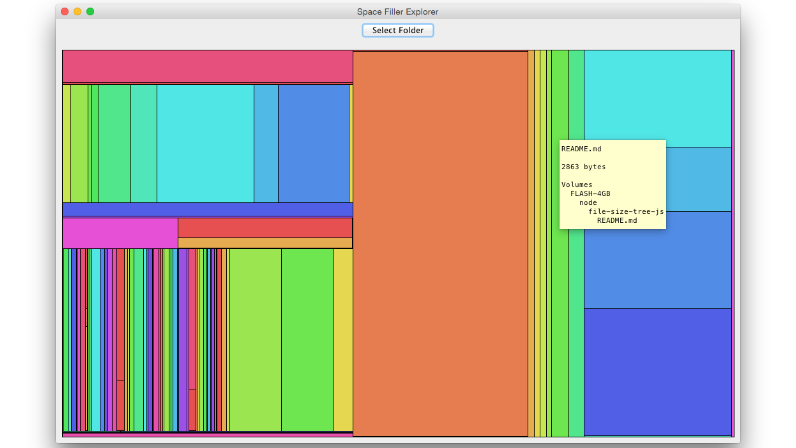
D3 Space Filler Explorer
The D3 Space Filler Explorer is an Electron application that uses multiple D3 visualizations to present the space consumed by the files in a hierarchical directory structure. The used and free space of each disk on the system is visualized with a two-segment pie chart. The space consumed by each of the files in a user-selectable directory is visualized with a treemap. The directory data structure visualized by the D3 treemap is generated by my file-size-tree-js package. The D3 Space Filler Explorer is open source and available on GitHub.
Video
COSMOS Desktop
COSMOS Desktop enables social scientists and other users with less technical backgrounds to collect, visualize and interrogate social media and curated data with a drag and drop user interface that requires no programming ability. Users can query data and iteratively refine selections to drill down into the data. COSMOS Desktop visualizations are coordinated so that when users select data in one view, the corresponding data in the other views is also highlighted.
Video
An Humane Network Analysis User Interface
The humane network analysis UI is my response to network analysis tools that require considerable configuration before users can view a graph of their network data. The humane network analysis UI promotes the zero configuration design approach that enables users to view their network data immediately and interact with that data with a set of tools that provide common network analysis operations.
Video
An Import Dialog with Individual File and Overall Progress Feedback
This video demonstrates a user interface I designed and implemented for importing files. The dialog provides feedback on the progress of individual files as well as the overall import progress.
Article
COSMOS One
COSMOS One was the first iteration of the Collaborative Online Social Media ObServatory (COSMOS) software platform. I used it as a test bed to work through ideas about user interface and visualization design, uses for Twitter data and how that data could be mashed with other sources.
Article
The Visible Clipboard
The visible Clipboard is a new idiom for copying and moving data that displays its contents whilst the data is being copied or moved. Current GUI clipboards confuse users because their contents is invisible: users forget what has been copied or cut onto the clipboard—a subsequent cut or copy without first pasting the contents of the clipboard can produce unintended results; furthermore, data can be lost if, after cutting some data to move it, some other data is then copied or cut onto the clipboard before pasting the data being moved. The visible clipboard eliminates these errors by displaying the data on the clipboard whilst it is being copied or moved: users always know what is on the clipboard when they initiate the spring-loaded copy and move quasi-modes.
Article
Progress Windows
Progress Windows provide feedback on the progress of lengthy operations while minimising the number of dialogs and windows that pop up and disappear. Good user interfaces give users feedback on the progress of lengthy operations such as opening or downloading large files. Current GUIs pop up progress bar dialogs that indicate how much of a lengthy operation remains. When several large files are opened or downloaded simultaneously, users can be distracted by the progress dialogs that pop up and disappear and the content widows that appear to replace them, often at different locations. Progress windows link progress bar dialogs with the content windows that replace them: the content window is opened straightaway and the progress bar is drawn in the content window; when the content has opened or downloaded, the content replaces the progress bar.
Article
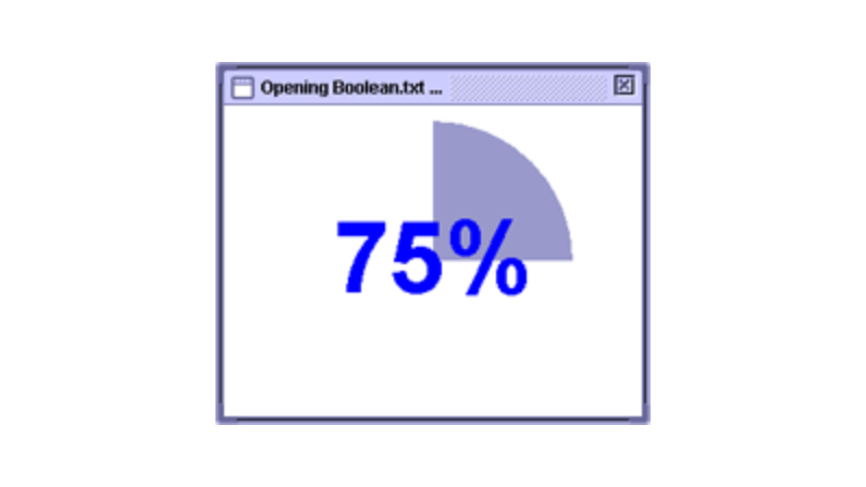
Progress Discs
Progress Discs present feedback on the progress of lengthy optical–media tasks, such as writing data to CDs and DVDs. Progress discs are based on pie charts, a scalable, compact visualization technique better suited to displaying multiple-category information than progress bars, which are often overloaded with information and lack a visual correspondence with the circular media they represent.
Article
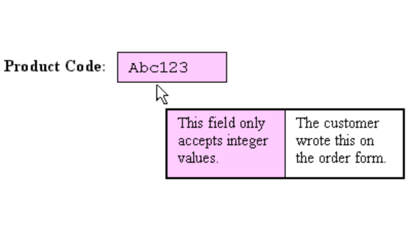
Flexible Input Controls
Flexible Input Controls enable users to enter invalid and inaccurate values to match the way software must sometimes be used. Current GUIs provide input controls that constrain input values to help software meet database integrity and validation rules. Users sometimes need to enter temporary values that they known are invalid or inaccurate but which are the only values available at the time. Current software is inflexible because it prevents temporary input of invalid values. Flexible input controls enable users to enter invalid values, to mark uncertain values, and to attach explanatory annotations to these values.
Article
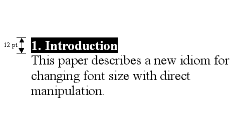
Font Size Direct Manipulation
The font size of a text selection can be changed more quickly and more easily by directly manipulating the text than by invoking a font dialog or by using toolbar controls. When this spring-loaded direct manipulation quasi-mode is initiated, a control is displayed that enables the user to change the font size of a text selection by dragging the control itself, by moving the mouse scroll wheel, or by typing in a new font size. An extension to this direct manipulation idiom provides a mini toolbar for changing other font characteristics including font name, and styles such as bold, italic, and underline.
Article
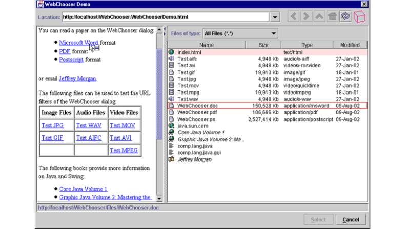
The WebChooser Dialog
The WebChooser Dialog enables files located on web pages and FTP sites to be opened directly into an application. The file selection dialogs provided by current GUIs assume that the files to be opened are located on the user's computer. To open a file published on a web page or an FTP server, users must first download the file with a web browser, and then open it using the application's file selection dialog. WebChooser is a new file selection dialog that enables users to open files that are published on web pages and FTP servers, as well as files stored on their computer. The WebChooser dialog also generalizes file selection to URL selection which increases the range of information that can be selected to include files, email addresses, newsgroups, and web queries.
Article
A Genetic Algorithm for Feature Labelling
This two-phase algorithm finds the optimum position of the features labels in interactive applications such as data visualization. In the first phase, a genetic algorithm searches for a set of label positions that minimizes the number of labels that overlap features, other labels, or the bounding box of the region to be labelled. The genetic search has a time limit to ensures the responsiveness of interactive applications. If any of the labels overlap after the genetic search is complete, the second phase of the algorithm makes small adjustments to the position of the overlapping labels to remove the overlaps.
Article
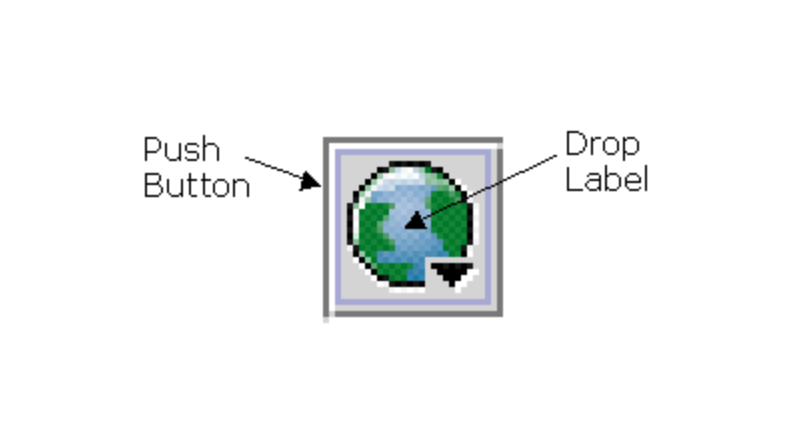
Drop Buttons
Drop Buttons provide a compact user interface for accepting input from a variety of input sources. Pushing the button pastes data copied onto the clipboard into an application. Dropping data onto the button's label transfers data into an application with a drag and drop operation. Right-clicking the button displays a drop down menu that enables users to invoke file selection and WebChooser dialogs to select files located on the local machine and on the web, respectively, and to invoke other application specific functionality.
Article
Partition Labels
Partition Labels provide a user interface for displaying and interacting with groups of partitioned data. Partition labels enable users to select the items in a partition, transfer the selected items in a drag and drop operation, and change the color of the partition.
Article
The Space Filler Explorer
The Space Filler Explorer is an application for navigating hierarchical filing systems with three co-ordinated views: a directory tree structure, a list of files, and a tree-map visualization of the files. A tree-map is a 2D space filling representation of a complex hierarchical tree structure: each file is visualized by a rectangle proportional to its size that eases rapid identification of large files. Users can dynamically query the tree-map visualization to filter out files based on their size using several relational operators. A pie chart provides a visualization of disk space usage.
Article
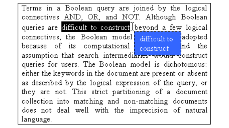
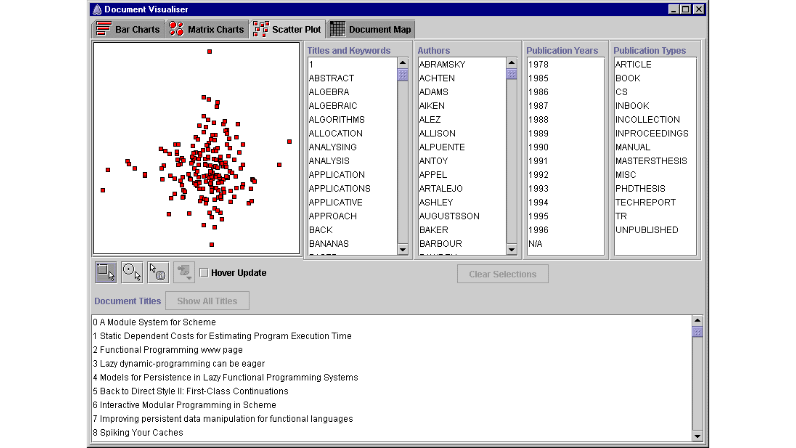
The Document Visualizer
The Document Visualizer is a prototype visualization tool for evaluating the relevance of information retrieval system search results. The imprecise matching algorithms used by IR systems return results that may not be relevant and users need to evaluate them for relevance. The Document Visualizer supports the results evaluation task by presenting search terms and document similarities in four visual styles: bar charts, matrix charts, scatter plots, and document maps. Users are able to explore the documents with dynamic query and interactive sorting facilities, and document details are available on demand.
Article
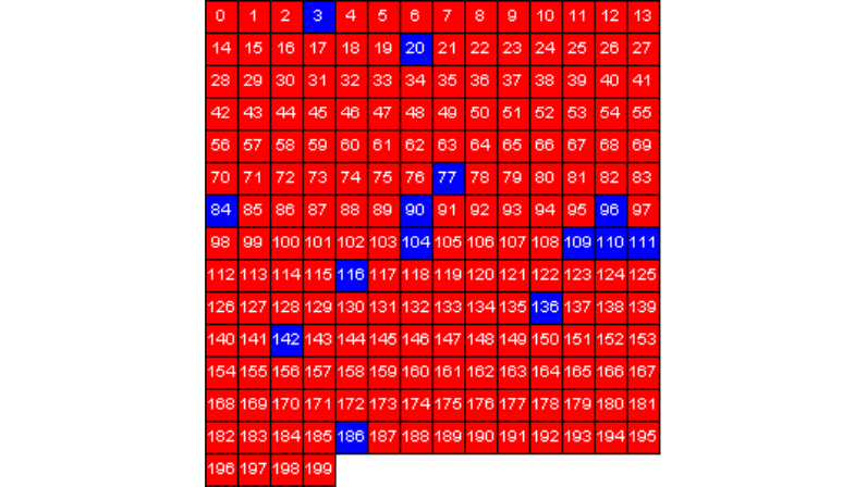
Document Maps
Document Maps are a visualization tool that help reduce the effects of information overload when using information retrieval systems. Information overload can occur in IR when users receive a large number of results. Document maps enable users to quickly filter a set of results to reduce or avoid information overload. Document maps show document similarity and frequently occurring search items. Document similarity is useful for showing which groups of documents within the results have a similar content. The frequency of occurrence of search items such as author names, publication years, and keywords, is useful for making quick decisions about other relationships between the results.
Article
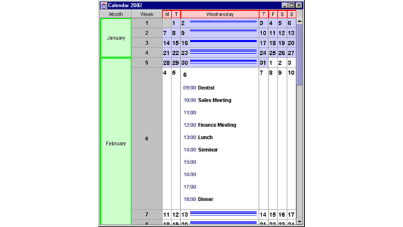
The Expanding Table
The Expanding Table is a tabular user interface component that expands and contracts table cells with smooth animation. Rows and columns can be expanded and contracted by dragging them with the mouse, or by applications that control them programmatically. The Expanding Table also provides a fisheye view of its cells, and is exemplified by the Expanding Calendar.
Article
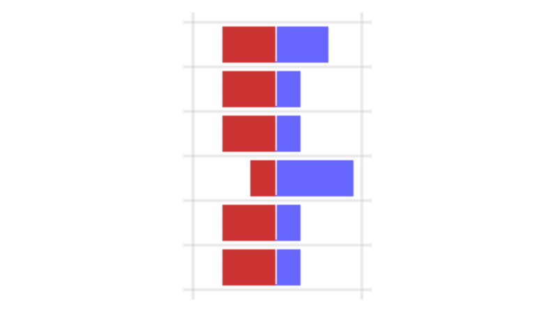
The Double-Ended Bar Chart
The Double-Ended Bar Chart is a compact visualization two numeric values for use in a single table cell. Visualizing a column of values with double-ended bar charts makes it easy to see trends and outliers in the data.