COSMOS One
COSMOS One was my first iteration and a test bed to work through ideas about user interface and visualization design, uses for Twitter data and how that data could be mashed with other sources.
The visualizations in COSMOS One are based on four analytics:
- Gender (detected using the 40,000 Namen gender database)
- Language (detected using the Language Detection Library for Java)
- Sentiment (analyzed by SentiStrength)
- Tension (analyzed by Cardiff University’s tension analyzer)
For more information on identifying demographics in Twitter data, please read:
- Knowing the Tweeters: Deriving Sociologically Relevant Demographics from Twitter
- Who Tweets? Deriving the Demographic Characteristics of Age, Occupation and Social Class from Twitter User Meta-Data.
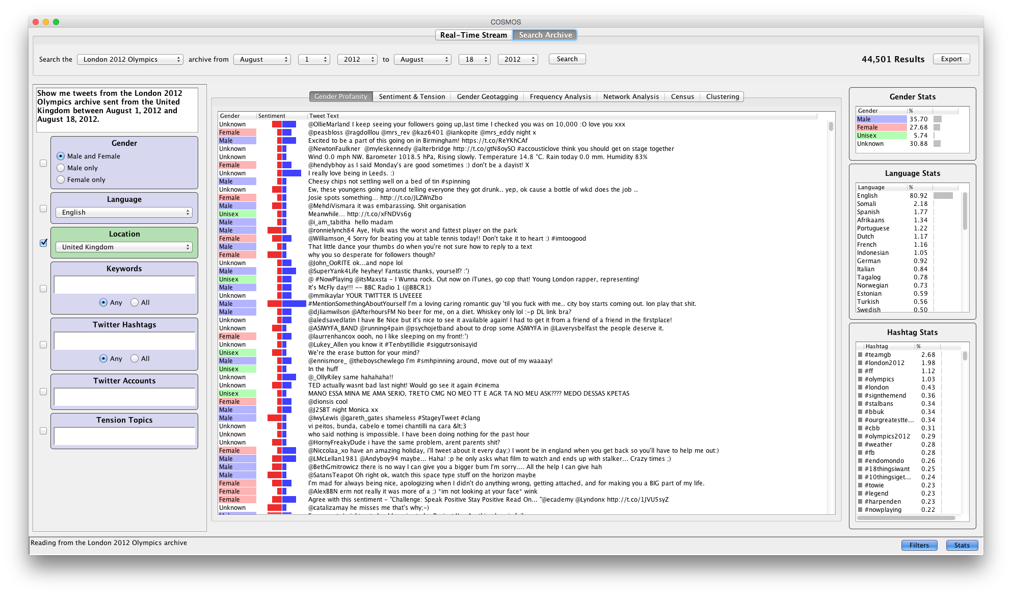
The COSMOS One user interface is composed of four areas:
- The data source control tabs
- The filters panel
- The stats panel
- The visualization tabs
The Data Source Control Tabs
The data source control tabs enable users to select either real time or archive search mode.
Real Time Mode
In real time mode, COSMOS One presents Twitter data from the one percent streaming API. The stats panels and many of the visualization tabs update to reflect the changes in the Twitter stream.
The real time tab provides two continually updated statistics:
- The number of incoming tweets per second (typically ranging from 30 to 100)
- The number of incoming tweets per second that match the filter settings

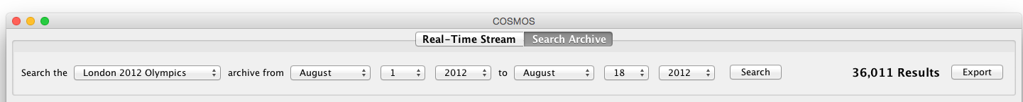
Archive Search Mode
In archive search mode, COSMOS One enables users to search several collections of Twitter data.
Archive searches are expressed in a natural language query input that structures the query clauses into an English sentence.
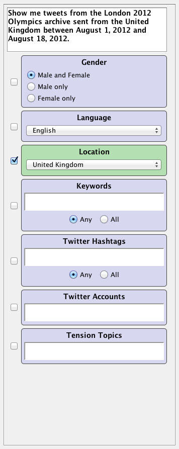
The Filters Panel
The filters panel contains a set of individually controllable filters; checked filters are active, unchecked filters are inactive. Each active filter adds a clause to the query that retrieves the results. As filters are checked or unchecked and filter parameters are updated, a natural language explanation is built dynamically that clarifies the query in English.
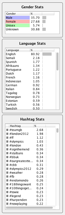
The Stats Panel
The stats panel contains three tables that provide users with an overview of the data in three categories:
- The gender breakdown
- The language breakdown
- The occurrence of hashtags
The Visualization Tabs
COSMOS One provides seven tabs that visualize Twitter data in a variety of styles:
- Gender Profanity
- Sentiment and Tension
- Gender Geotagging
- Frequency Analysis
- Network Analysis
- Census
- Clustering
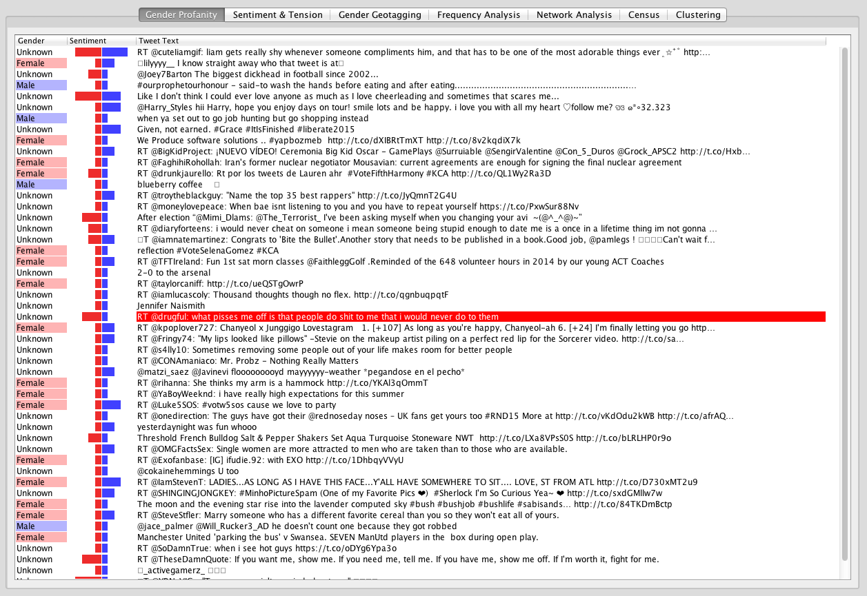
The Gender Profanity Tab
The Gender Profanity tab presents a tabular view of the Twitter data with each row providing the following information for each tweet:
- The text
- The gender of the author
- The sentiment of the text
Gender is presented with a color-coded background:
- Blue - male
- Pink - female
- Green - unisex
- White - unknown
Sentiment is presented as a double-ended bar chart. With zero at the centre, the red negative sentiment bar increases in magnitude to the left, and the blue positive sentiment increases in magnitude to the right. The double-ended sentiment bar chart is a custom-built Java component that provides an implementation of a custom Swing JTable table cell renderer.
Rows with white text on a red background highlight profanity within the tweet text. Profanity is identified by matching the words in the tweet text with words in a profanity dictionary.
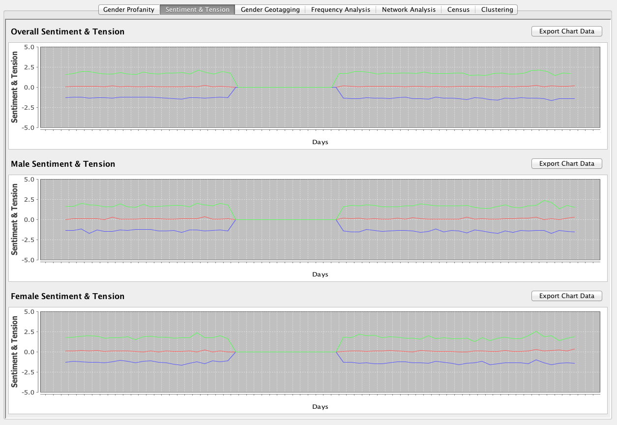
The Sentiment and Tension Tab
The Sentiment and Tension tab presents the sentiment and tension of the tweet text as line charts over time.
The first line chart presents the sentiment and tension over time aggregated over all genders. The second and third line charts present the sentiment and tension broken down by male and female, respectively.
The data used to build the three sentiment and tension line charts is exportable in CSV format. Exporting the data enables further manipulation and visualization of the data in other applications such as spreadsheets.
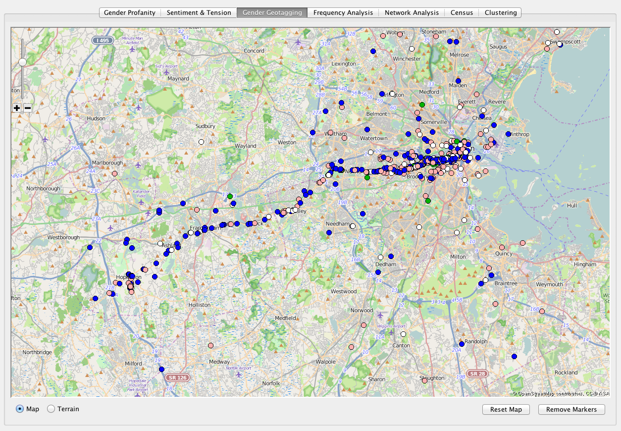
The Gender Geotagging Tab
The Gender Geotagging tab presents geolocated tweets on a map as color-coded circular markers:
- Blue - male
- Pink - female
- Green - unisex
- White - unknown
The map is provided by OpenStreetMap and is implemented using the JMapViewer Swing component. Both map and terrain views are user selectable.
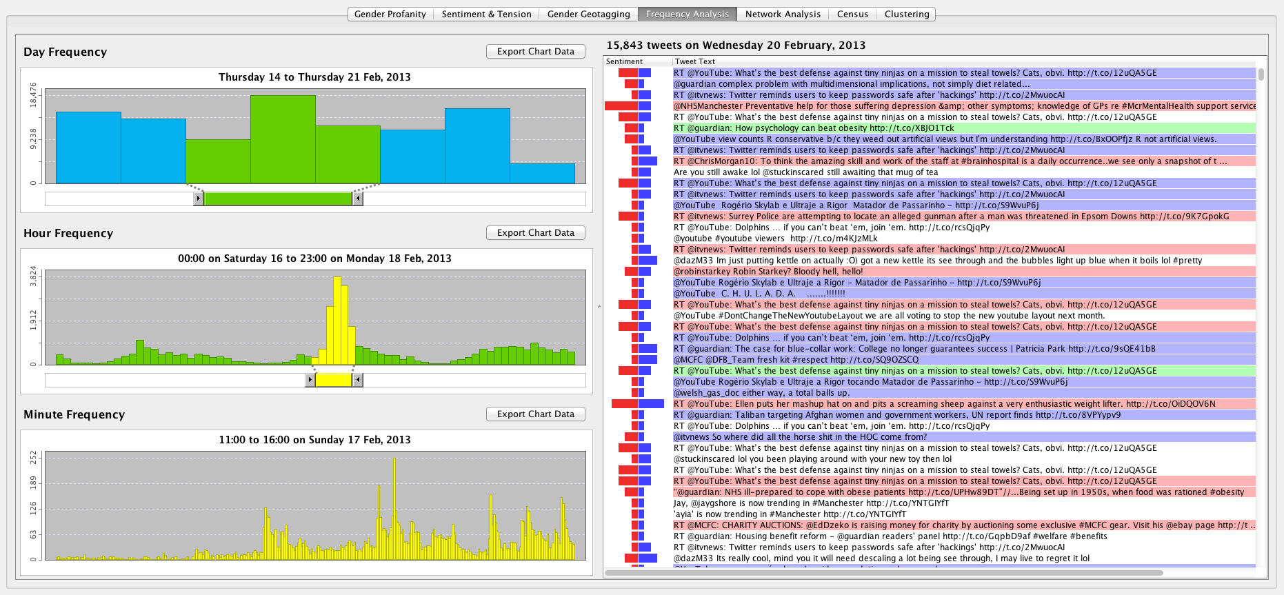
The Frequency Analysis Tab
The Frequency Analysis tab provides frequency views at three levels of temporal granularity:
- The day frequency chart shows the number of tweets authored per day
- The hour frequency chart shows the number of tweets authored per hour
- The minute frequency chart shows the number of tweets authored per minute
Moving the mouse over the bars enables users to scrub details on the exact day, hour or minute represented by the current bar. As users scrub over the bars, the tweets represented by each bar are displayed in the table to the right. This table is similar to the tabular presentation used by the Gender Profanity tab. The difference is there is no gender column. Gender is instead represented by color-coding the background of each row.
The day, hour and minute frequency charts are connected by the double-ended sliders below each chart. The green slider below the day frequency chart selects a day range that controls the data displayed in the hour frequency chart. The hour frequency chart displays the number of tweets authored per hour within the day range selected by the day frequency slider. Similarly, the yellow slider below the hour frequency chart selects an hour range that controls the data displayed in the minute frequency chart. The minute frequency chart displays the number of tweets authored per minute within the hour range selected by the hour frequency chart.
The data used to build the three bar charts is exportable in CSV format. Exporting the data enables further manipulation and visualization of the data in other applications such as spreadsheets.
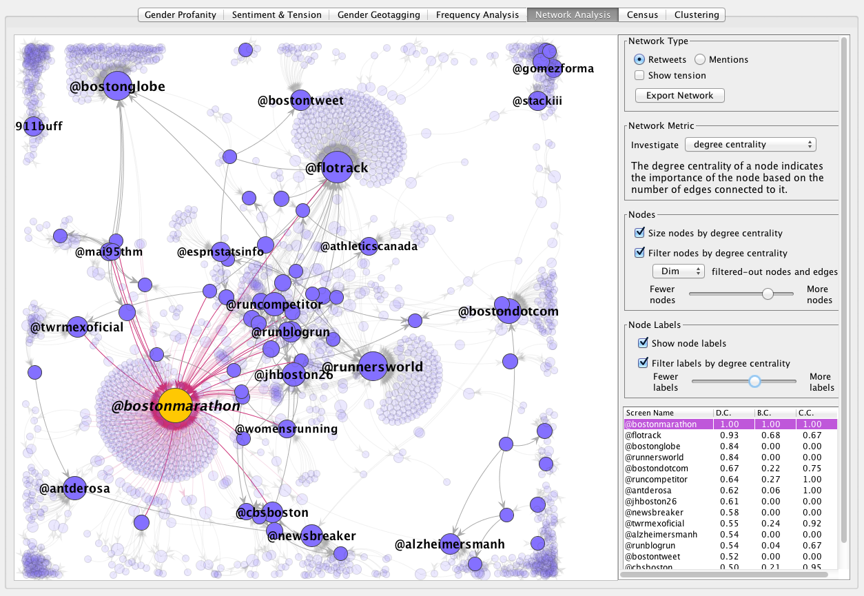
The Network Analysis Tab
The Network Analysis tab provides a social network graph based on retweets or mentions.
The network graph is built automatically using a force-directed layout algorithm without requiring users to input configuration parameters or other settings. This approach to user interface design enables users to work with the network immediately, which is contrast to tools such as Gephi that require considerable knowledge and user input to produce a network graph.
The size of the nodes represents one of three user-selectable network metrics:
Nodes are filtered with a slider that removes nodes with a metric value greater than the slider value. Nodes that have been filtered out and the edges that connect them are displayed in two user-selectable styles:
- Dimmed
- Filtered out nodes and edges are drawn semi-transparently to maintain their context in the network
- Hidden
- Filtered out nodes and edges are not drawn to provide a clean view of the remaining nodes and edges
Node labels are filtered with a slider that hides the labels of nodes with a metric value greater than the slider value.
The data used to build the social network graph is exportable in GEXF, GraphML and JSON format. Exporting the network graph data enables further manipulation and visualization in applications such as Gephi or libraries such as D3.
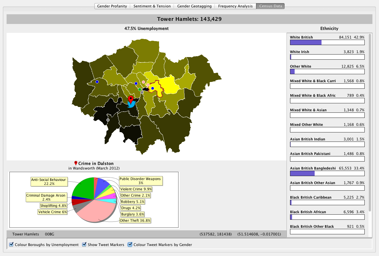
The Census Tab
The Census tab presents ideas for mashing together naturally-occurring social media data with the curated data of the 2001 UK census (the results of the 2011 census were not available at the time).
A choropleth map of the London boroughs visualizes the level of unemployment in each borough with a shade of green; the lighter the shade, the higher the level of unemployment. Mousing over each borough highlights the border of the borough in red and updates the ethnicity bar chart to the right of the choropleth.
The ethnicity bar chart shows the number of inhabitants of the borough broken down by the ethnicity categories used by the UK census; the longer the bar, the greater the number of inhabitants with that ethnicity.
Unemployment was a useful statistic because it provides a numeric range of data suitable for calculating the color range of the choropleth. Similarly, ethnicity was a useful statistic because it provides a numeric range for calculating the lengths of the bars over a fixed number of categories.
Clicking a point on the boroughs choropleth displays the crime for district containing the point. The crime statistics are retrieved from the UK Police API and broken down by the eight major crime types used by the Metropolitan police force.
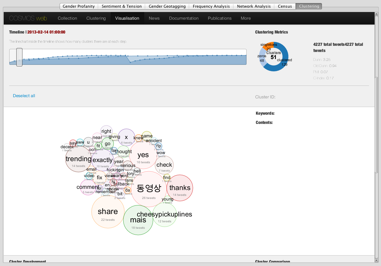
The Clustering Tab
The clustering tab enables COSMOS One users to log in to a remote clustering service running on a Jenkins server. The Jenkins web application is rendered in a JavaFX WebPane component.