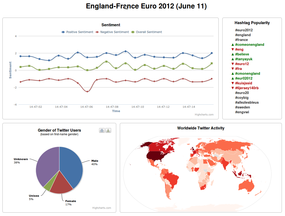
Euro 2012 Twitter Dashboard
The Euro 2012 Twitter Dashboard presents multiple views of a Twitter data set containing tweets related to the England-France match in the Euro 2012 football championship. The data set comprises 35,678 tweets selected over an 18 hour period starting around 3pm on June 11, 2012. Tweets were selected from the Twitter streaming API with the keywords England, France and Euro2012. The 35,678 tweets were authored by 34,209 unique Twitter users.
The dashboard presents four views of the data:
- A line chart of sentiment scores
- A list of popular hashtags
- A pie chart of tweet author genders
- A choropleth map map of the world showing tweets per country
The following image shows the web-based user interface of the dashboard:
The dashboard plays the data like a movie by updating the data views to present the data at each point in time. The following video shows a segment of the data movie:
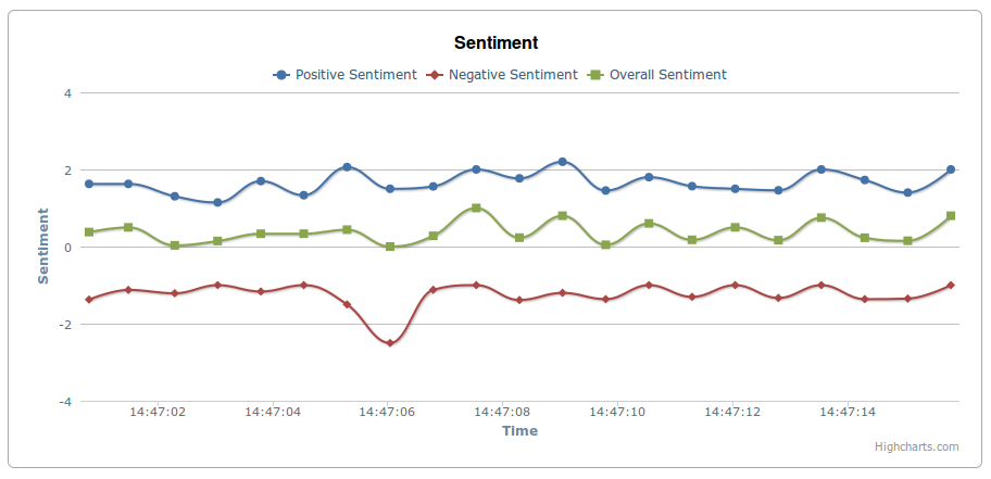
Sentiment Line Chart
The sentiment line chart updates over time and plots the average sentiment scores of all the tweets authored at the same second. The sentiment of each of the 35,678 tweets was analyzed with the SentiStrength sentiment analysis tool. SentiStrength provides three sentiment scores per text:
- Positive sentiment (an integer between 1 and 5) measures the amount of positive sentiment in the text
- Negative sentiment (an integer between -1 and -5) measures the amount of negative sentiment in the text
- Overall sentiment that classifies the text as either positive, negative or neutral (since positive texts can contain some negative sentiment and vice versa)
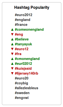
Hashtag Popularity List
The hashtag popularity list updates over time to show how the popularity of the hashtags used in the 35,678 tweets changes throughout the match. The entries in the hashtag list are marked with color- and shape-coded triangles:
- Green, upward-pointing triangles represent hashtags that have increased in popularity
- Red, downward-pointing triangles represent hashtags that have decreased in popularity
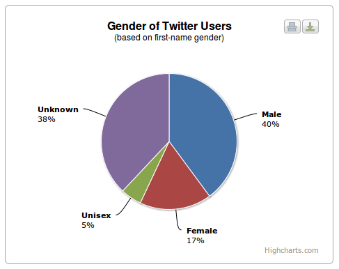
Gender Pie Chart
The gender pie chart shows the gender breakdown of the tweet authors.
The gender of each tweet author was identified by submitting the first name of the author to the 40,000 Namen database that maps first names onto gender. For more information about this technique, please read Knowing the Tweeters: Deriving Sociologically Relevant Demographics from Twitter.
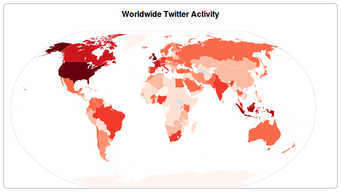
Worldwide Twitter Activity Choropleth Map
The Worldwide Twitter Activity Choropleth map shows the number of tweets authored in each country. The number of tweets authored in each country is represented with a shade of red; the darker the shade the greater the number of tweets from users in that country.