
The Document Visualizer
The imprecise matching algorithms used by information retrieval systems return results that may not be relevant and users need to evaluate them for relevance. This article describes the Document Visualizer, a prototype document visualization tool that supports the results evaluation task by presenting search terms and document similarities in four visual styles: bar charts, matrix charts, a scatter plot, and a document map. Users are able to explore the documents with dynamic query and interactive sorting facilities, and document details are available on demand.
1. Introduction
The Document Visualizer is a prototype document visualization tool that displays search terms and document similarities in four visual styles: bar charts, matrix charts, a scatter plot, and a document map. The development of this tool was motivated by the need to support information retrieval (IR) system users when they evaluate a set of results for relevance. Section 2 describes the results evaluation task and the need for a tool to support users. Section 3 describes how the search term frequency and document similarity information is extracted from a set of documents, and section 4 describes how this information is displayed in the four visual styles.
2. Supporting the Results Evaluation Task
IR systems use automated matching algorithms to match queries with documents to retrieve a set of results. The automated and often simplistic nature of these matching algorithms means that information judged relevant by an IR system will not necessarily match the more sophisticated relevance judgement of users. A typical set of results will therefore contain irrelevant as well as relevant results. Users must then examine the results to find the relevant ones.
A tool for supporting the results evaluation task should:
- help users to deal with large numbers of results by summarizing them;
- make the relationships between the results explicit;
- enable users to quickly identify interesting characteristics and trends within the results; and
- provide tools to search and sort the results.
Overall, a summary of results should present the similarities between documents and all the search terms such as author names, publication years, and keywords. Users have difficulty thinking of search terms when making IR queries and often do not know how to start a search (Chen & Dhar 1990). Explicitly presenting the search terms enables users to recognize the interesting ones, and to use them as a basis for evaluating results. Search terms are useful for highlighting relationships such as all the documents written by the same author or published in the same conference proceedings.
Document similarity is useful for showing which groups of documents within the results have a similar content. IR system users expend a large amount of effort every year searching for similar documents.
Visualization techniques help people traverse large bodies of data and identify significant trends and relationships. Presenting search terms and document similarity information with visualization therefore seemed a particularly promising way to support IR results evaluation. The Document Visualizer presents the search terms and document similarities in four visual styles: bar charts, matrix charts, a scatter plot, and a document map. The next section describes the search term and document similarity information presented by the four visualizations.
3. Document Information
The four visualization styles present a view of a set of documents using the search term and document similarity information extracted from the documents.
3.1 Search Term Information
Four groups of search terms are extracted from the documents: the keywords found in the title and the keywords of a document, the surnames of the authors, the year in which the document was published, and the type of publication, such as a book, journal, or the proceedings of a conference. Each document is numbered and a record is kept of which search terms occur in each document.
3.2 Document Similarity Information
The similarities between the documents are represented by a numerical measure of similarity calculated with a latent semantic analysis (LSA) of the documents. LSA is an established technique that represents documents as points in a multi-dimensional space (Deerwester et al. 1990). In this space documents are placed nearer to similar documents than to dissimilar ones.
The input to an LSA is a matrix of word-document occurrence data. This is constructed by first identifying the terms in the documents and then removing the stop words such as and, the, and but. The term-document occurrence matrix is built by calculating how often each term occurs in each document.
The output of an LSA is a set of numerical dimensions that describe the position of the documents in the multi-dimensional space. The first three dimensions are used to calculate the distance between documents in a 3D space. To calculate the numerical similarity between documents i and j, the Euclidean distance, d, between document i(x1, y1, z1) and document j(x2, y2, z2) is calculated as:

where xi, yi and zi are the 3D co-ordinates of the points that represent documents i and j. The numerical similarity between documents i and j is the value d.
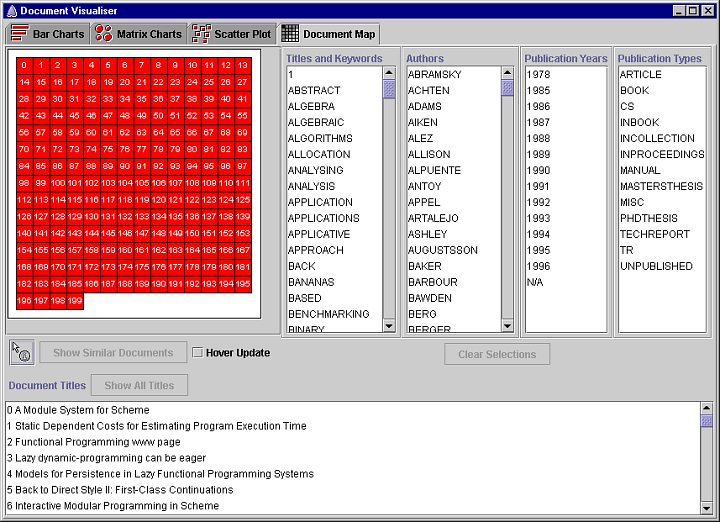
4. The Document Visualizer
The Document Visualizer presents the search term frequency and document similarity information in four visual styles: bar charts, matrix charts, a scatter plot, and a document map. The four visualization styles are selected by the tabs in the top left of the window. Each tab is marked with an icon that symbolises the type of visualization. Users are able to explore the documents with dynamic query and interactive sorting facilities, and document details are available on demand.
4.1 Bar Charts
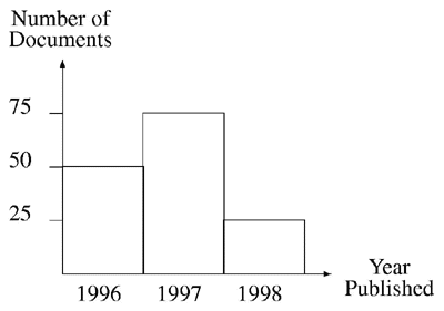
A bar chart is a visualization of a set of quantities. Each quantity is represented by a rectangle; the height of the rectangle is proportional to the size of the quantity. The frequency of search terms can be shown by representing the frequency of each search term with a bar. For example, the following bar chart shows the number of documents, from a set of 150 results, that were published in either 1996, 1997, or 1998, i.e. it shows the frequency of occurrence of the publication year search terms 1996, 1997, and 1998.
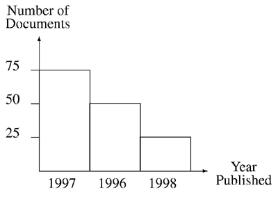
Bar charts can be sorted. The bar chart below the data in the above bar chart after it has been sorted in descending order of frequency.
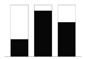
Users may find it difficult to accurately compare the lengths of distant bars because the accuracy of perceptual judgements of two objects decreases as the distance between them increases (Chambers et al. 1983). Further, Webber’s Law states that there must be a certain percentage difference between two lengths before they can be recognized as different lengths (Webber 1846 cited by Chambers et al. (1983)). If the difference between the lengths of two bars is not sufficient due to the nature of the data, users need extra perceptual clues to help them decode the information. The bar charts visualization uses framed rectangles to enable accurate comparisons to be made between bars. Framed rectangles make it easier to see the differences in bar lengths by providing an extra length: the distance from the top of the bar to the top of the frame, as shown below.
The following screenshot shows the bar charts visualization of the Document Visualizer. The bar charts visualize the frequency of occurrence of the four groups of search terms: keywords, author names, publication years, and publication types. The Publication Years bar chart clearly shows how many documents were published in each year.
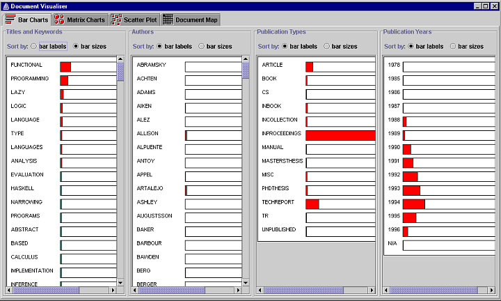
Comparison between distant bars is also supported by an interactive sorting facility. Sorting enables users to see immediately the largest and smallest frequencies. The bar charts are initially sorted by the labels of the bars which are the search terms, as selected by the bar labels radio button. The keyword, author name, and publication type search terms are sorted in alphabetical order. The publication year search terms are sorted in numerical order. Each bar chart can be sorted independently by the frequency of occurrence of the search terms by selecting the bar sizes radio button. The Authors bar chart in figure 4 has been sorted by bar size to show that Jones has written the most documents.
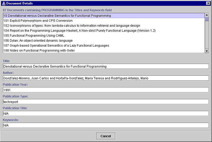
More information about the documents that contain a search term is available by clicking on the bar or its label. The document details dialog shown below lists all the documents that contain the search term. This dialog shows all the documents that contain the search term programming, as selected from the Titles and Keywords bar chart. Selecting the title of a document in the scrolled list displays the details of the document in the fields below the list.
4.2 Matrix Charts
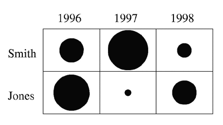
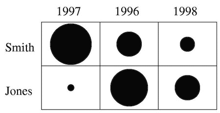
A matrix chart is a visualization of a two-dimensional table of quantities. Each quantity is represented by a circle; the diameter of the circle is proportional to the size of the quantity. The frequency of occurrence of two types of search term can be shown by producing a table containing the frequency of occurrence for those search terms. For example, the following table shows the number of documents, from a set of 150 results, that were published by two authors, Smith and Jones, in 1996, 1997, and 1998, i.e. it shows the frequency of occurrence of the publication year search terms 1996, 1997, and 1988 for the author search terms Smith and Jones.
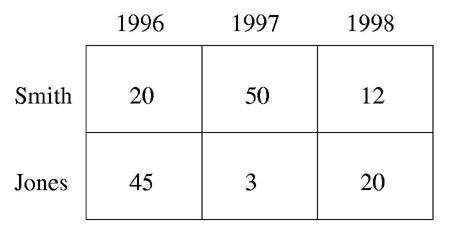
The differences between the values do not stand out because each number takes up the same amount of space. The matrix chart below shows the same information but each quantity is represented by the diameter of a circle. The differences between the diameters stand out immediately.
Matrix charts can be sorted. The following matrix chart shows the above matrix chart after the row representing the search term Smith has been sorted in descending order of frequency. Sorting enables the user to see immediately the largest and smallest frequencies.
The following screenshot shows the matrix charts visualization of the Document Visualizer. The matrix charts are divided into three groups: Authors, Publications, and Keywords. Each group is displayed by selecting one of the tabs at the top left of the screenshot. The authors tab contains the Authors x Publication Years and Authors x Publication Types matrix charts, the Publications tab contains the Publication Years x Publication Types matrix chart, and the Keywords tab contains the Keywords x Publication Years and Keywords x Publication Types matrix charts.
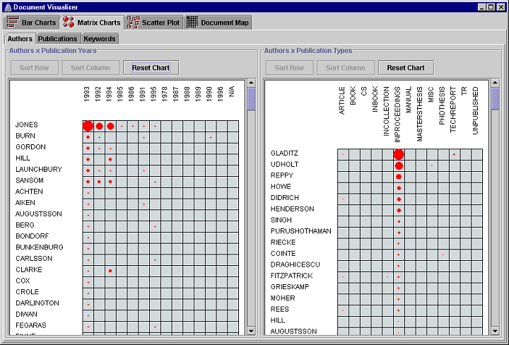
The elements of each matrix chart show the frequency of occurrence of two search terms. More details about the documents that contain the two search terms are available by clicking on the element. A document details dialog is displayed to show all the documents that contain both search terms.
The rows and columns of each matrix chart are initially sorted alphabetically, or numerically in the case of publication years. The rows and columns of each matrix chart can be sorted in decreasing order of frequency. Rows are sorted by clicking on a row label and pressing the Sort Row button. Columns are sorted by clicking on a column label and pressing the Sort Column button. In the Authors x Publication Years matrix chart shown in the screenshot above, the row representing Jones and the column representing 1993 have been sorted; in the Authors x Publication Types matrix chart, the column representing In Proceedings has been sorted. A matrix chart can be reset to its initial order by pressing the Reset Chart button.
4.3 Scatter Plot
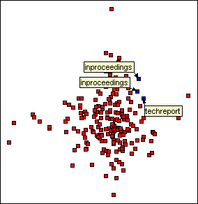
A scatter plot is a visualization of the distribution of a set of data points. Scatter plots are useful because they show interesting features of the distribution such as clusters and outliers. The following scatter plot shows the similarity of 12 documents where Di represents a document and similar documents are placed near one another.
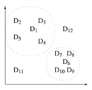
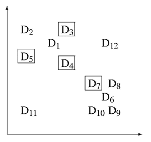
The similarity of two documents is decoded from figure 10 by determining the distance between the data points that represent them. For example, document 1 is more similar to document 3 than to document 12. The scatter plot shows two clusters of similar documents, documents 1, 2, 3, 4 and 5, and documents 6, 7, 8, 9 and 10. It also shows two outliers, documents 11 and 12. Search term frequencies are represented by highlighting the data points that represent documents that contain the search term. The frequency is decoded by counting the number of highlighted data points, as shown below.
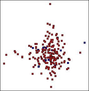
The following screenshot shows the Document Visualizer’s scatter plot visualization.
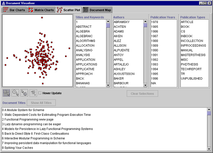
Clicking on a document square highlights it in blue and highlights the title of the document in the document titles list at the bottom of the window. Double clicking a document square displays the document details dialog box shown in the following screenshot. If the Hover Update box is checked, the contents of the document details dialog is updated by moving the cursor over a document square; there is no need to double-click each document square to update the details.
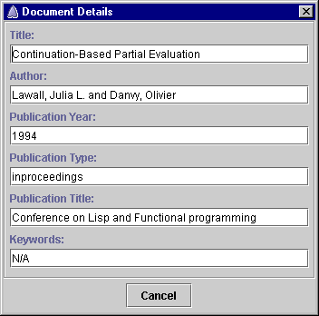
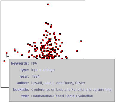
The details of a document can also be displayed using the details on demand tool. Pressing the mouse button over a document square will display a window below the cursor that displays the details of the document, as shown in the following screenshot. Dragging the cursor over the scatter plot updates the contents of the window with the details of the document currently under the cursor. Releasing the mouse button hides the window.
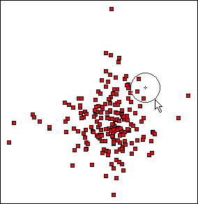
One or more documents can be selected using the rectangular or circular bullseye selection tools (below left). The document squares that represent the selected documents are highlighted in blue and the titles of the documents are listed in the document titles list. Selected documents can be labelled with one of the following attributes: title, keywords, author names, publication type, publication year, or the title of the document in which the document is published, if any (below right). The Document Visualizer uses a genetic algorithm to position the labels.
To the right of the Document Visualizer’s scatter plot are four scrolled lists that present the four groups of search terms. Presenting all the search terms makes it easier for users to explore the documents because they can see what search terms they contain. Selecting a search term in one of the lists highlights the document squares on the scatter plot that represent the documents that contain the search term, as shown below. Dragging a list selection from one search term to the next enables the user to dynamically query the scatter plot.
Dynamic queries enable users to modify the selection criteria of a query by adjusting graphical widgets like sliders and to see the results of the query immediately. Rapid feedback encourages exploration because if the results are not what the user expected, the operation is reversible by dragging the slider back to its previous position. Because the ranges and intermediate values are tightly controlled by the slider, an entire set of syntactic and semantic errors are avoided. Dynamic queries have been used successfully in a variety of visualization applications such as the dynamic home finder (Williamson & Shneiderman 1992), and the FilmFinder (Ahlberg & Shneiderman 1994).
A new query is completed each time an item in one of the scrolled lists is selected and the results are retrieved and displayed immediately. Once one or more relevant documents have been identified, the proximity of neighboring documents can be used to identify other documents that might also be relevant.
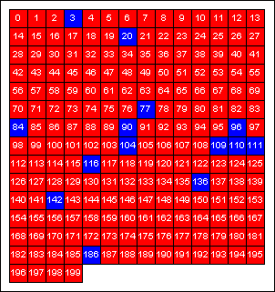
4.4 Document Map
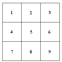
The document map visualizes a set of documents as a square matrix of numbered squares. The following document map visualizes 9 documents. Document maps are a compact representation that scale well; a 15×14 matrix is required for 200 documents and only 32×32 is required for 1000 documents.
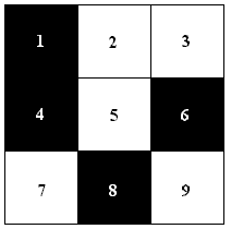
The results of exploring a set of documents with the search terms is shown by highlighting the squares on the document map that represent documents that contain the selected search terms. Figure 19 shows a document map with documents 1, 4, 6, and 8 highlighted. When a document map has been queried, the number of highlighted documents is immediately visible.
The following screenshot shows the document map visualization of the Document Visualizer. Clicking on a document square highlights it in blue and highlights the title of the document in the titles list. Double clicking a document square displays a document details dialog similar to the one shown earlier. If the Hover Update box is checked, moving the cursor over a document square will update the contents of the document details dialog; there is no need to double-click each document square to update the details.
The details of a document can also be displayed using the details on demand tool. Pressing the mouse button over a document square will display a window below the cursor that displays the details of the document (as shown above for the scatter plot visualization). Dragging the cursor over the document map updates the contents of the window with the details of the document currently under the cursor. Releasing the mouse button hides the window.
To the right of the document map are the same four scrolled lists used by the scatter plot visualization. Document maps are searched using the same dynamic query interface as the scatter plot. Selecting a search term in one of the lists highlights the document squares on the document map that represent documents that contain the search term, as shown below.
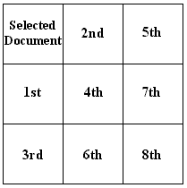
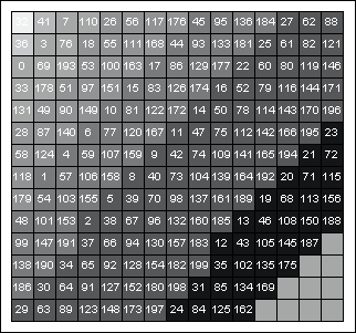
The strength of the document map is its presentation of the similarity between one user selected document and the remainder of the documents. Document similarity is shown by selecting a document and pressing the Show Document Similarity button.
The presentation of document similarity involves rearranging and shading the document squares. The documents are first sorted according to their similarity to the selected document using the numeric similarity measure described in section 3.2. The selected document is placed in the top left hand corner of the document map. The remainder of the document squares are arranged diagonally from top left to bottom right in descending order of similarity. Proximity is used to place the documents most similar to the selected documents closer to it on the document map, as illustrated below. The first and second most similar documents are in the first diagonal next to the selected document. The third, fourth and fifth most similar documents are in the next diagonal. The eighth similar is in the final diagonal.
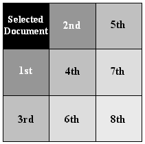
The document squares are then shaded in grey scale. Shading emphasizes the different degrees of similarity between the selected document and the other documents. The shade of grey is proportional to the numeric similarity measure, the greater the similarity the darker the grey. The shading was influenced by statistical maps that use shading successfully to represent quantities such as concentrations of population and disease (du Toit 1988).
The following document map shows the similarities between document 32 and the remainder of the documents.
References
- Ahlberg, C. and B. Shneiderman, The alphaslider: A compact and rapid selector, in B. Adelson, S. Dumais and J. Olsen, eds, Proceedings of CHI ‘94, 1994: 365-371.
- Chambers, J. M., W. S. Cleveland and B. Kleiner, Graphical Methods for Data Analysis, Wadsworth, 1983.
- Chen, H. and V. Dhar, User misconceptions of information retrieval systems, International Journal of Man-Machine Studies 32, 1990: 673-692.
- Deerwester, S., S. T. Dumais, G. W. Furnas, T. K. Landaur and R. Harshman, Indexing by latent semantic analysis, Journal of the American Society for Information Science 41(6), 1990: 391-407.
- du Toit, S. H. C., A. G. W. Steyn, and R. H. Stumpf, (1986), Graphical Exploratory Data Analysis, Springer-Verlag.
- Webber, E. H., Der Tastsinn und das Gemeinfühl, Handwörterbuch der Physiologie 3, 1846: 481-588.
- Williamson, C. and B. Shneiderman, The dynamic home finder: Evaluating dynamic queries in a real-estate information exploration system, in N. Belkin, P. Ingwersen and A. M. Pejtersen, eds, Proceedings of SIGIR ‘92, 1992: 338-346.