Learning User Preferences to Personalize Smart Card Applications
This article describes how a record of the actions taken with a user interface can be used to personalize it to individual users. The user interface of an Automated Teller Machine is used to show how transaction data stored on a smart card can be used to personalize the order of the options.
1. Introduction
This article describes how a record of the actions taken with a user interface can be used to personalize it to individual users. User preferences can be learnt by accumulating a history of the actions taken by users. A history of the actions that have been taken in the past can be used to calculate the probability that an action will be taken, and to rank actions according to the likelihood of their being taken. These probabilities can also be used to calculate the probability that a particular action will be taken given that another action has already been taken. The user interface of an Automated Teller Machine (ATM) provides an example of how transaction data stored on a smart card can be used to personalize the order of the options.
2. Automated Teller Machines
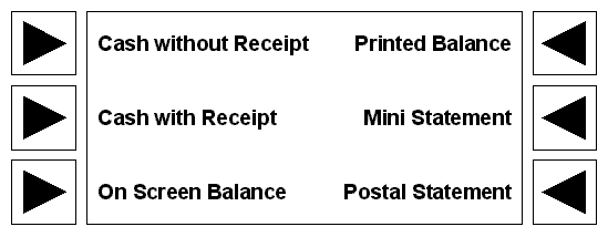
The user interface of an ATM typically contains a list of between six and eight options. Each option is presented on the screen next to the button that invokes the choice. The following illustration shows the layout of an ATM with six commonly occurring choices:
- Cash without Receipt
- Cash with Receipt
- On Screen Balance
- Printed Balance
- Mini Statement
- Postal Statement

In cultures in which text is read left to right, top to bottom, the most prominent option is the first option in the left hand column.
2.1 Recording ATM Actions
The choices made by the user during a transaction with an ATM can be recorded as a set of binary parameters. A transaction is defined as all the options chosen between the insertion and return of the card. The following table lists a set of nine transactions with the ATM illustrated above. A 1 indicates that an option was chosen, a indicates that it was not chosen. For simplicity, only three of the options have been chosen: Cash with Receipt, On Screen Balance, and Postal Statement.
| Cash with Receipt | On Screen Balance | Postal Statement | |
|---|---|---|---|
| 1 | 1 0 |
0 1 |
0 0 |
| 2 | 1 0 |
0 1 |
0 0 |
| 3 | 1 0 |
0 1 |
0 0 |
| 4 | 1 0 |
0 0 |
0 1 |
| 5 | 1 | 0 | 0 |
| 6 | 0 | 1 | 0 |
| 7 | 0 0 |
1 0 |
0 1 |
| 8 | 0 1 |
1 0 |
0 0 |
| 9 | 0 | 1 | 0 |
It is becoming more common that ATM cards are smart cards that provide enough storage for a set of binary parameter values. Storing transaction data on the user’s card saves storage on the bank’s computer.
2.2 Personalizing ATM Options
The set of choices on an ATM screen is similar to a set of options in a pull down menu. User interface design guidelines recommend placing the most frequently used options near the top of the menu to reduce search times and to make option selection less error prone. It follows that to minimize the time spent searching for an ATM option, the most frequently chosen options should be in the left hand column and near to the top; the least frequently chosen options should be in the right hand column and near the bottom.
For the user interfaces of desktop applications, the most frequently chosen menu options relate to the most frequently required tasks, which are application dependent. The most frequently chosen ATM options depend on the user. The simplest solution is to analyze the options that are most commonly chosen by all users and build a model of the average ATM user. The options of the ATM would then be ordered according to this model.
As well as the most frequently chosen option, preferences need to record sequences of commonly chosen options, such as always choosing Postal Statement after choosing Cash with Receipt.
If some options have never been chosen or are very rarely chosen, they can be relegated to a secondary screen of options displayed by selecting an option such as Other Options on the main screen. I discuss the usability implications of reordering ATM options in my article about a conceptual model for personalizing an ATM.
The order preferred by the model user is better than an arbitrary order but does not help users whose preferences differ from the model user, or whose preferences change over time. A better solution is to personalize an ATM to each user.
One of the ways that the user interface of an ATM can be personalized is to order the options according to the probability of being chosen by the user. The probability that the user will make a particular choice can be calculated from a history of past transactions with the ATM. Actions can be recorded as a simple binary choice: the action is taken or it is not taken. This choice can be represented as true or false, 1 or 0, or with some other values with a binary relationship.
User preferences are learned by reinforcement: the more frequently an option is chosen, the greater the number of transactions in the history that represent the selection of that option indicating that it is a preference. When the user’s preferences change, the new preferences must be learned and the old preferences forgotten. The old preferences will no longer be reinforced because fewer occurrences of the old preferences will be added to the history. The transactions that reflect the new preferences will then dominate the history.
2.3 Ordering the First Screen
The order of the options on the first screen is determined by how frequently they have been chosen in the past. For example, if the user most often begins a transaction by requesting cash with a receipt, then this option should be at the top of the left column. Further, if the users habit is to request a mini statement after withdrawing cash with a receipt, then the first option on the next screen should be mini statement.
We can calculate the following non-zero prior probabilities from the table above:
p(Cash) = 6 9 = 0.67
p(Balance) = 7 9 = 0.78
p(Statement) = 3 9 = 0.33
These probabilities indicate that the order of the options on the first screen should be:
- On Screen Balance
- Cash with Receipt
- Postal Statement
- …
where … indicates that the remaining options have zero probability of being chosen according to the history and the standard ATM order should be used.
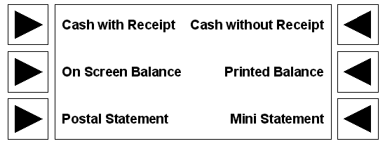
Closer analysis shows that although On Screen Balance is chosen more often than Cash with Receipt, the latter is chosen more often first. This gives the following ordering:
- Cash with Receipt
- On Screen Balance
- Postal Statement
- …
The following illustration shows the reordered ATM options.

2.4 Ordering the Second Screen
Bayesian probabilities can be used to order the choices on each subsequent screen the user sees after making a choice. In current ATMs, each subsequent screen contains the same options as the previous screen. In an enhanced ATM, each screen can be tailored to present the most likely next choice given the choice made on the previous screen.
The following form of Bayes theorem is used to calculate the posterior probability of event A occurring given that event B has already occurred:

We can calculate the following non-zero Bayesian probabilities from the table above and the prior probabilities we calculated from it:
p(Balance | Cash) = 0.7778
p(Statement | Cash) = 0.0909
p(Cash | Balance) = 0.25
p(Statement | Balance) = 0.1667
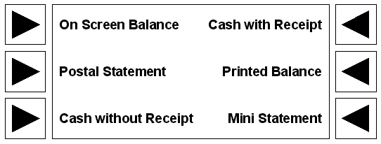
These probabilities provide the order for the options on the second screen. If the first option chosen was Cash with Receipt, then the order of the second screen will be:
- On Screen Balance (p = 0.7778)
- Postal Statement (p = 0.0909)
- …
The following illustration shows this order of ATM options.

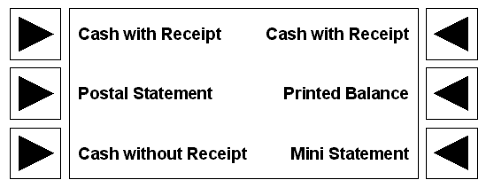
If the first option chosen was On Screen Balance, the order will be:
- Cash with Receipt (p = 0.25)
- Postal Statement (p = 0.1667)
- …
This order of ATM options is shown below.

