
A Java Class Framework for Describing Application Parameters
This article describes a Java class framework for describing application parameters of commonly occurring data types. Each parameter describes its current value and the allowed range of values that enable its value to be validated and constrained. The framework can automatically construct a user interface component for each type of parameter that enables users to view and edit parameter values. Parameters can be grouped into sets and the framework can automatically generate the user interface of a parameter set which contains the user interface component of each parameter in the set. The framework fires an event when the value of a parameter changes.
1. Introduction
This article describes a class framework for describing sets of parameters of commonly occurring data types. The framework can automatically construct a user interface component for each type of parameter that enables users to view and edit parameter values. Parameters can be grouped into sets and the framework can automatically generate the user interface of a parameter set which contains the user interface component of each parameter in the set. The framework fires an event when the value of a parameter changes.
2. Parameters
The parameter framework can describe eight commonly occurring data types: Boolean, String, Numeric, Numeric Range, Enumerated, Multiple Choice, Colour, and URL. Each parameter stores its name, a short description of its purpose, and its current value. The numeric range, enumerated, and multiple choice parameters also store the allowed range of values.
Parameters can be grouped into sets that contain one or more parameters. Parameters are made persistent by saving and loading parameter sets.
The value of a parameter can be set programmatically or by the user with the controls described in the next section.
3. User Interface
The framework can generate the following user interface components for the corresponding parameters. The framework can also generate a user interface component for each parameter in a set.


The user interface of each type of parameter consists of a label and a widget for displaying and editing the current value of the parameter. The text of the label to the left of the widget is the name of the parameter. When the cursor is hovered over the label, the description of the parameter is displayed as the tooltip text.
The Boolean parameter component (a) consists of a single checkbox; the value of the parameter is true if the box is checked, false otherwise. Either true or false must be selected; the default value is false.
The String parameter component (b) is a text input box. Input is optional and the default value is the empty string.
The Numeric parameter component (c) is a text input box that enables unconstrained numeric input, including exponential notation. Input is optional; if no input is entered, the value is zero.
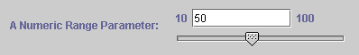
The Numeric Range parameter component (d) consists of a numeric slider and a text input box. The user can select a numeric value between the displayed minimum and maximum value by moving the slider. A value is always selected; the default is the minimum value. The text input box above the slider enables unconstrained numeric input. When the return key is pressed, the value is validated immediately and is constrained to fall within the minimum and maximum value. The slider is updated to reflect the new value. Entering a value in the text input box is optional. If no value is entered, or an invalid value is entered, the value is the minimum value.
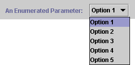
The user interface of an Enumerated parameter (e) depends on the number of alternative values. If there are two values, two radio buttons are displayed, one for each option. If there are three or more values, a combo box is provided that contains all the values. A value is always selected; the default value is the first of the alternatives.
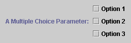
The Multiple Choice parameter component (f) presents a set of check boxes, one for each value. Zero or more options can be chosen; the default is that no options are chosen.
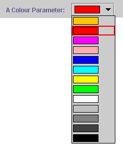
The Colour parameter component (g) is a combo box that provides a selection of colours. A colour must be chosen; the default is the first colour, yellow.
The URL parameter component (h) provides three methods of input: a text input box enables a URL to be entered, and the two buttons to the right of the input box enable users to select a URL with file selection and WebChooser dialogs, respectively. WebChooser dialogs return URLs and a URL is constructed for files selected with a file selection dialog. The text of the selected URL is displayed in the input box. URLs entered into the text input box must be able to be parsed into a valid URL; the URL does not need to refer to a valid resource, but it must be a well formed URL.
4. Implementation
The following diagram shows the classes that describe each type of parameter, group them into sets, and fire an event when their values change. Each class that describes a type of parameter is a sub-class of the Parameter class. Parameters are grouped together in a ParameterSet object that contains a list of one or more Parameter objects. A ParameterSet object also maintains a list of objects that implement the ParameterSetEventListener interface. A ParameterSet object fires an event whenever the value of a parameter is edited; each event listener is sent a ParameterSetEvent object that specifies the Parameter object that has changed.
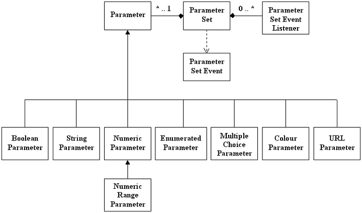
The Parameter and ParameterSet classes implement the Serializable interface, which enables them to be made persistent.
The following diagram shows the classes that implement the user interface components of the parameter classes shown in the diagram above. The user interface of each parameter is a sub-class of the Parameter-Component class. The ParameterPanel class generates the user interface of a parameter set using a ParameterSet object. ParameterPanel objects can be added to a dialog for presentation to the user.
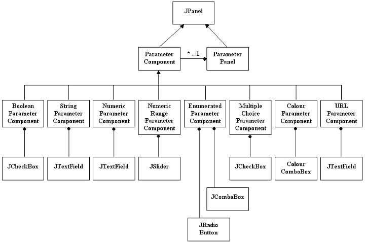
As far as possible, the user interface components constrain the values that can be input to removes a whole range of syntactic and semantic input errors. The values of the Boolean, Numeric Range, Enumerated, and Colour parameters are constrained by their respective method of input and do not need to be validated: their user interface components guarantee a valid value. The values of Numeric and URL parameters are entered into text input boxes and need to be validated, as described above.
5. Improvements
The parameters described in this article cover a wide range of commonly used types of parameter. Many more general and application specific parameter types can be added.
The colour parameter component provides a range of commonly used colours, but can be improved by enabling users to choose any colour with a colour chooser dialog.
The ParameterPanel class is designed to display and edit individual parameter values and there is no interaction between parameters. It may be desirable to disable a parameter if a particular value of another parameter is selected. This is good user interface design but cannot be implemented in this framework. An improvement would be to enable parameters to be linked, perhaps with an XML description of the interactions between them.