Compactly Visualizing Data with a Double-Ended Bar Chart
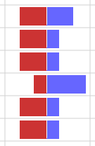
This article describes a double-ended bar chart that compactly visualizes two numeric values in a single table cell. Visualizing a column of values with double-ended bar charts makes it easy to see trends and outliers in the data.

The double-ended bar chart was inspired by sparklines and double-sided bar charts.
Sparklines are information-dense graphics often presented in table cells or next to accompanying text. Although many different sparkline styles have been developed, the most common kinds display bar and line charts that present the variable of interest on the vertical axis.
Double-sided bar charts display horizontal bars aligned on a central vertical axis. This type of chart typically compares the value of two variables, such as the number of male and female births on the horizontal axis over a number of years on the vertical axis.
The double-ended bar chart combines the compact representation of a sparkline with the horizontal layout of the double-sided bar chart.
Example
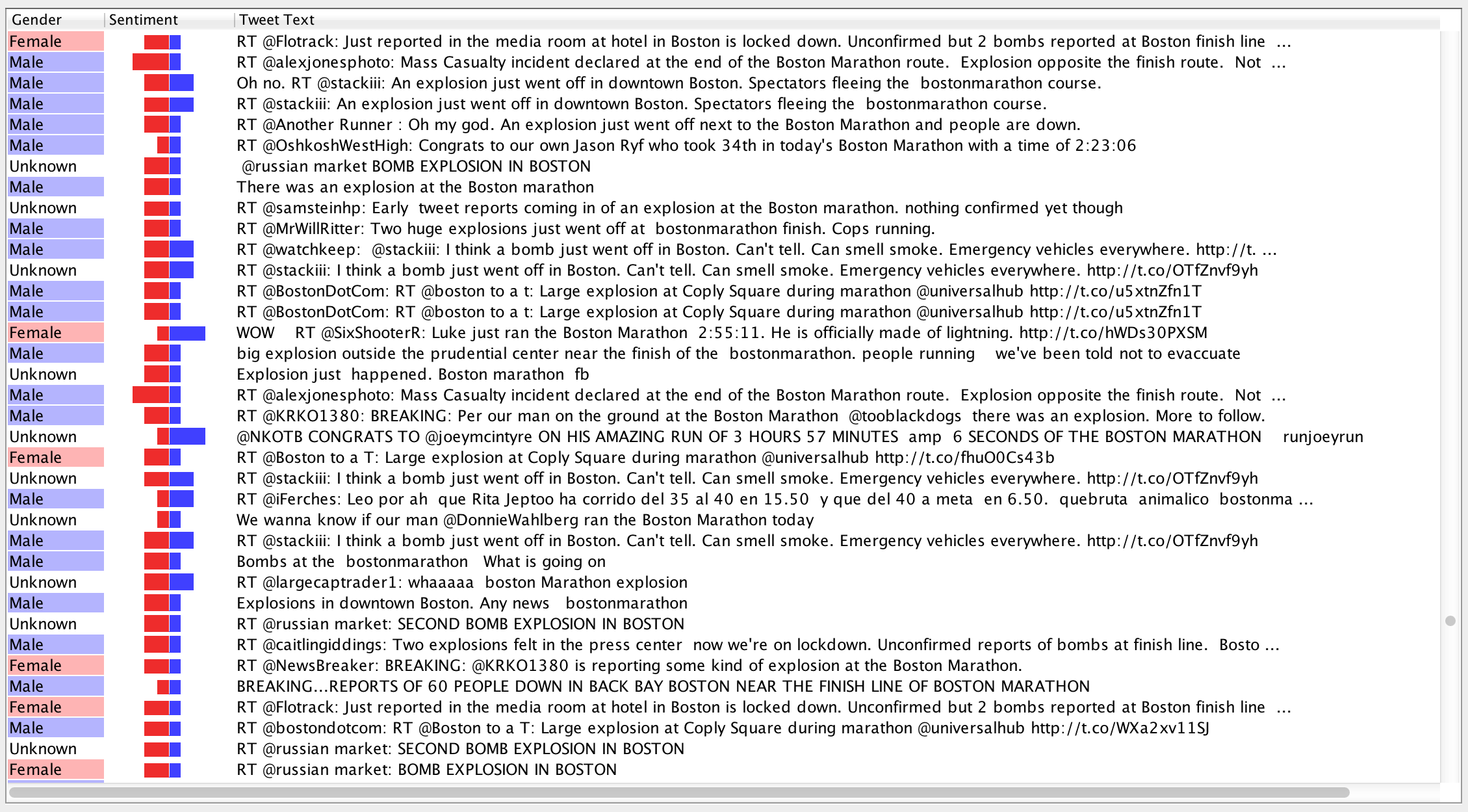
Although the double-ended bar chart can display any two numeric values, it was designed to compactly present the positive and negative sentiment in a table of tweets.

Sentiment analysis assigns a numeric value to a text by analyzing the emotional content of the text.
In this example, the sentiment scores were calculated by SentiStrength, which assigns two scores to a text. The positive score is an integer between 1 and 5 that represents the amount of happiness or positivity in the text; the greater the positive score, the greater the amount of happiness or positivity. In contrast, the negative sentiment score is an integer between -1 and -5 that represents the amount of sadness or negativity in the text; the smaller the negative score, the greater the amount of sadness or negativity.
Calculating the Bar Lengths
The maximum width of both the left and right bars is half the width of the table cell. The width of each bar is the maximum width of the bar multiplied by the proportion of the bar’s value to the bar’s maximum value.
For example, when displaying SentiStrength sentiment scores, the maximum value of both the left and right bars is 5. If the width of the table cell is 100 pixels, a positive sentiment score of 4 is represented by a bar with a width of 4 / 5 * 50 = 40 pixels. Similarly, a negative sentiment score of -3 is represented by a bar with a width of 3 / 5 * 50 = 30 pixels.
In practice, adding a few pixels of padding around a double-ended bar chart visually separates it from the table cell borders and from it’s neighboring cells.
Implementation
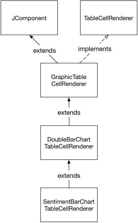
I implemented the double-ended bar chart in the above example as a custom table cell renderer for the Java Swing JTable component. The following diagram shows the Java class hierarchy of the double-ended bar chart.

The GraphicTableCellRenderer class is the base class that extends the JComponent class and implements the TableCellRenderer interface. This class clips the contents of the JComponent object to the bounds of the table cell.
The DoubleBarChartTableCellRenderer class extends the GraphicTableCellRenderer class to draw the double-ended bar chart within the clipped table cell bounds. This class has properties that specify the values represented by the left and right bars.
The SentimentBarChartTableCellRenderer extends the DoubleBarChartTableCellRenderer class and implements the getTableCellRendererComponent method. This class takes the Object-typed value parameter and casts it as object that contains the positive and negative sentiment scores that provide the values for the left and right bars.
