How to Create a Dashboard Widget Bar Icon
When creating my Add-on Stats dashboard widget, I couldn’t find an online tutorial for creating a widget bar icon. Apple’s Designing Widgets page lists some basic information about the dimensions of the icon’s contents and the size and orientation of the icon’s drop shadow, but nothing about the dimensions of the icon itself or how to create the curved glass effect used by most other icons on the widget bar. After some trial and error, I developed the following tutorial for creating widget bar icons.
I’ve divided this tutorial into four parts:
Although my examples use GIMP 2.4 for macOS, all the techniques and tools should work in Photoshop and other similar software.
Part 1 — Create the Icon Image
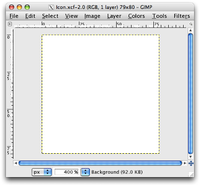
Create a new 79×80-pixel image with a white background. The white background highlights the drop shadow–we’ll hide the white background before creating the final PNG version of the icon. Scale the new image to 400% and save it as Icon.xcf.
Part 2 — Create the Drop Shadow
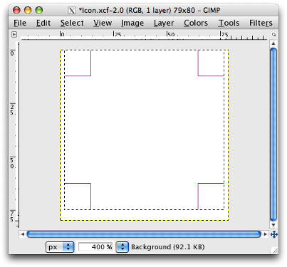
Create a new transparent layer called Drop Shadow and draw a 75×75-pixel selection. Align the top of the selection along the top edge of the image. Centre the selection horizontally to leave a 2-pixel margin either side.
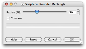
Round the corners of the selection by invoking the Edit > Rounded Rectangle option and moving the slider to 30%.
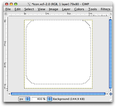
Click OK to round the corners of the selection.
The drop shadow of a widget bar icon is 3 pixels wide with 50% opacity and is primarily below the icon. To create the drop shadow, select the Filters > Light and Shadow > Drop Shadow filter and enter the following values.
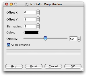
Click OK to produce the drop shadow.
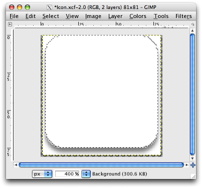
To accommodate the drop shadow, GIMP increases the dimensions of the image to 81×81 pixels by adding 1 pixel below the image and 1 pixel either side of the image. Crop these unnecessary pixels to reduce the dimensions of the image to the original 79×80 pixels.
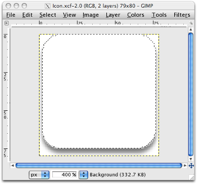
Part 3 — Create the Glass Effect
Set the foreground colour to the main colour for the icon. I’ll use black because black always looks good. Create a new transparent layer called Icon Background and fill the rounded selection with the foreground colour.
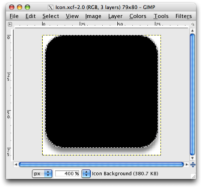
Shrink the rounded selection by 2 pixels by invoking the Select > Shrink option.
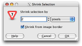
Click OK to shrink the selection.
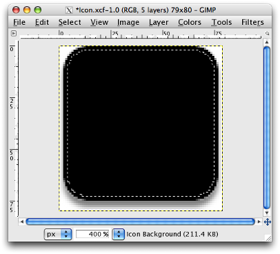
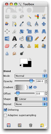
Set the foreground colour to white and select the Transparent to Foreground gradient tool.
Create a new transparent layer called Glass and draw a gradient line the length of the height of the icon. Start the gradient line a fifth of the length of the icon from the bottom edge of the icon, and end the line a fifth of the length of the icon above the top of the icon, which extends above the top edge of the image.
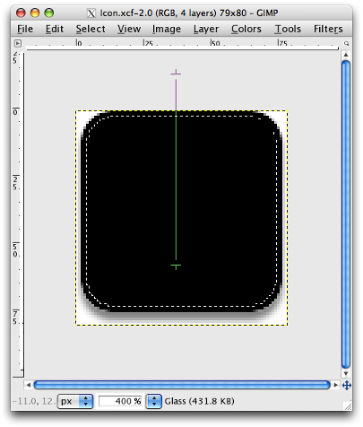
The gradient should look like this.
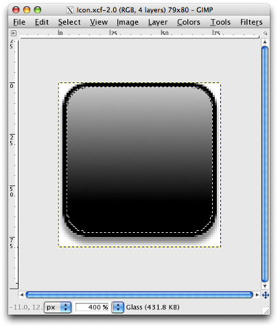
To finish the glass effect, we need to remove the bottom part of the gradient to create the characteristic curve. Select the elliptical selection tool and set it to subtract from the current selection.
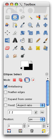
Draw an elliptical selection and position the bottom edge of the selection half way down the icon.
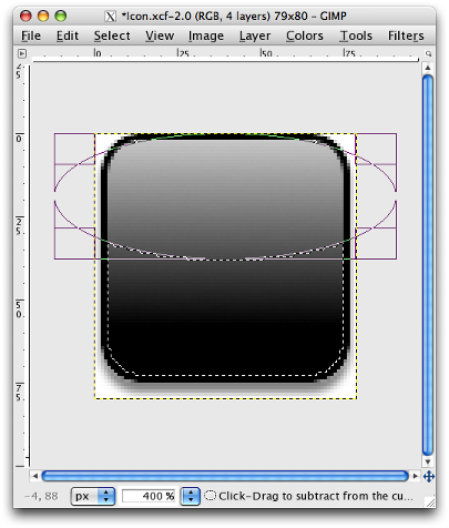
Click on the grey area around the image to reveal the subtracted selection.
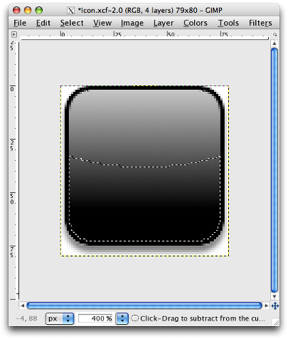
Select Edit > Clear to delete the contents of the selection on the Glass layer. This creates the curved shine of the glass effect.
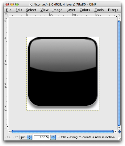
The finishing touch is to add a slight gradient to the bottom half of the icon just below the curve. Set the foreground colour to a lighter shade of the main icon colour. I’m using black so set the foreground colour to a dark shade of grey, such as #323232.
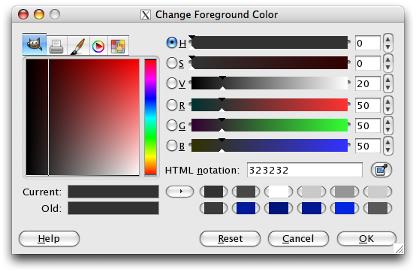
Select the Transparent to Foreground gradient tool. Create a new transparent layer called Glint and draw a gradient line the length of half the height of the icon. Start the gradient line one fifth of the height of the icon from the bottom edge of the icon.
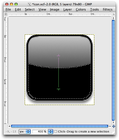
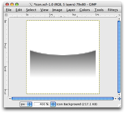
The effect of this gradient is very subtle.
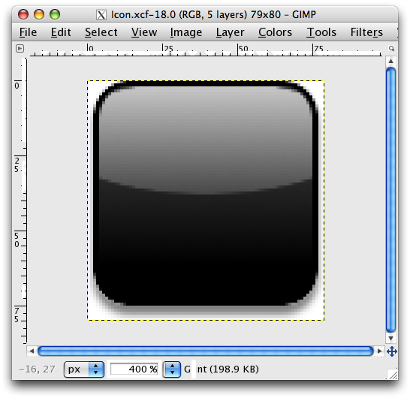
To prove that the Glint layer really does contain a gradient, here is the gradient on the white background layer.
Part 4 — Create the PNG file
To finish the icon, hide the white background layer and save the image as Icon.png.
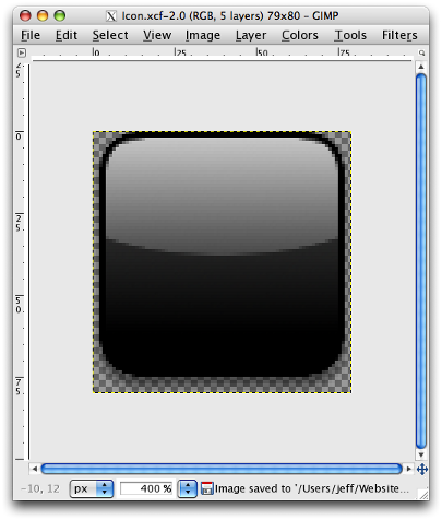
So, after all that work, we’ve got a 79×80-pixel glass-effect icon ready for importing into Dashcode.

You’ll probably want to add widget-specific graphics to your icon. Create a new layer and add your graphics on the new layer.
